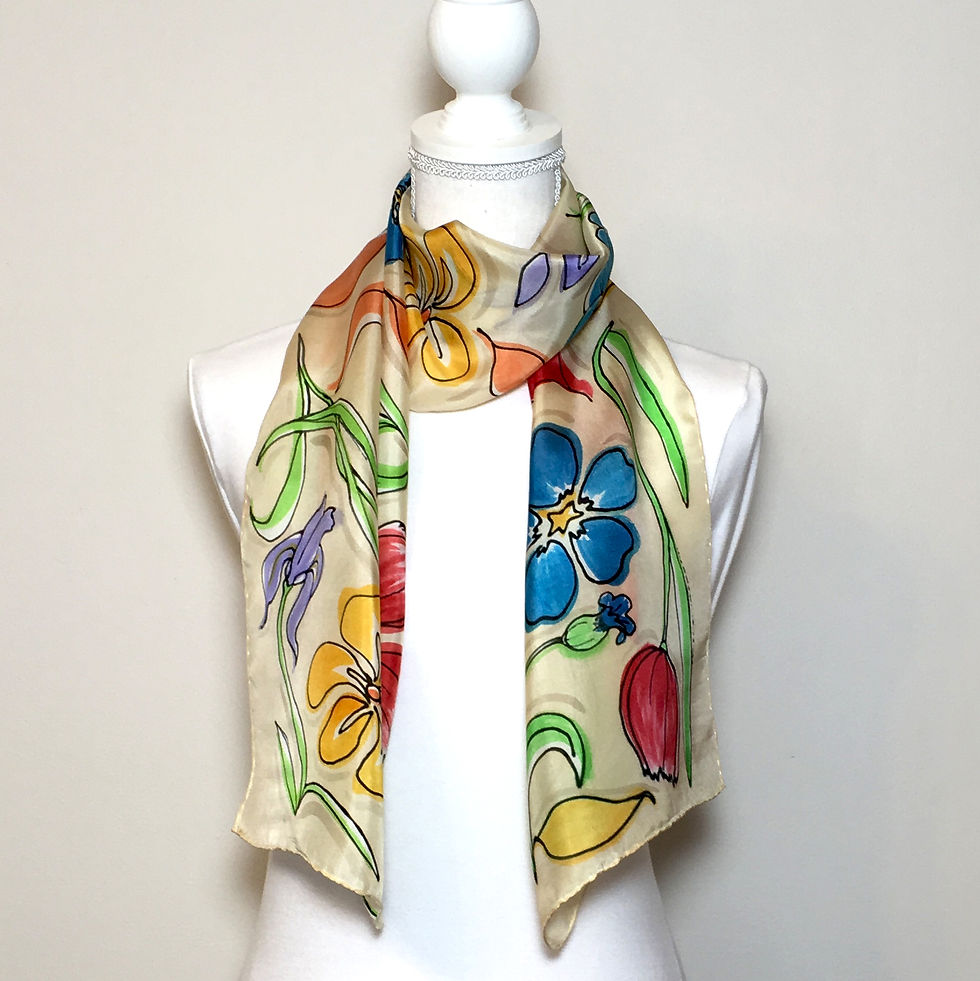
Colorful Educated Guesses
- Carrie Wright

- Feb 26, 2020
- 3 min read
Obviously, one of the most important aspects of my silk painting is color. Putting different colors together in an overall palette for any piece is a tremendous joy to me, so you might imagine what a disappointment it is to steam something up and rinse it only to discover nothing turned out as I thought it would. If a piece is still pleasing to the eye, I will sell it, but I do always go back to attempt mixing to the palette I actually wanted so that I can learn.
The reason I sometimes fail is that the dyes do not look the same before and after steaming. In the first photo above is a finished bandanna, and the second shows what it looked like prior to steaming. Notice how different the reds are as well the overall flatness of all the colors before steaming. The third photo captures the moment the scarf was unrolled coming fresh from the steamer, and you can hopefully notice between the third and first photos above that it changed slightly after being rinsed due to it being freed of its excess dye.
What is "excess dye?" you might ask. When the dye is steam set, a chemical reaction is taking place inside the cell structure of the silk fiber. The protein inside the cells of each fiber are permanently bonded to the pigment in the dye, but a cell can only absorb so much pigment. The final step of my process for wearables is to thoroughly rinse, suds with a special textile detergent, and rinse again to ensure you don't end up covered in dye if you're ever caught in a rainstorm! This does not diminish or "fade" a piece in the slightest. Again, it is excess dye.
Worth mentioning here is the amount of variance in the level of intensity you might see using the same dye on different types of silk. Shinier fabrics, such as satin charmeuse, yield the highest saturation to your eyeballs, whereas matte fabrics, such as a twill or crepe de chine, tend to quiet and slightly darken tones. The density of the fabric is at issue as well with floaty fabrics like chiffon yielding much less detail and depth of color than a heavy shantung. It's all about how the light is interacting with the fabric, not that the dye is literally changing colors. (If you'd like, I'll take some time in another post someday to talk about the differences in the silks I use. Let me know, and I'll write it up!)
Every project starts with mixing dyes. Even with all of the colors leftover that I've saved from past projects, I typically end up custom mixing enough of at least a couple of hues for each project. The whole process is not as simple as grabbing a crayon from a box, and this is part of what you're paying for when you purchase a CWS piece. When I mix, I have a scrap of silk mounted in an embroidery hoop as a tester. I work all of my shades from a limited color range of just 13 Jacquard Red Label dyes: magenta, scarlet, poppy red, tangerine, yellow, kelly green, cyan, royal blue, digital, purple, chocolate brown, brown sienna and black.* I adjust hues as I please adding a few drops of this or that dye, always having specific shades in my mind's eye I'm trying to achieve.
The amount of variance in tone between wet, dry, then steamed and rinsed is striking. I find reds to be particularly difficult to gauge, as well as the extremely pale tones of creams and grays. I've learned that darker tones, like the dark avocado I was mixing for this project, are best judged when they are still wet. Light tones, though, are better represented after they're dry. A piece of plain white silk looks gray when wet with water alone, for example. I am excited about my color work these days specifically because I've gotten very good at achieving exactly the shade I was after, of knowing ahead of time precisely how a color is going to change from start to finish. I've grown in confidence, and I think that is evident in my work these days, as is the joy I have creating the color palettes you've seen from me lately!

*PRO TIP: Even though I use concentrated dyes, I still choose to mix my black. I've found a mix of equal parts black, scarlet and kelly green yields a much richer, blacker black on silk whereas using the black straight from the bottle feels a bit flat. In addition, I typically prefer warmer charcoal tones, and mixing to a pleasing gray is far easier when working with my custom mix of black.


A Cowboy Coat is a longer, more protective variant of the classic jacket, ideal for harsh weather. It’s a statement piece. Find a well-made coat at Western Jacket.